Histogram (आयतचित्र) In Hindi
Histogram को हिंदी में “आयतचित्र” भी कहा जाता है। यह एक प्रकार का आँकड़ानुशासन है जिसमें डेटा के विभिन्न वर्गों की विशिष्ट संख्या या आवृत्ति को बताने के लिए बार चित्र का उपयोग किया जाता है। इसे विशेष रूप से डेटा की विस्तारित जानकारी और पैटर्न का पता लगाने के लिए प्रयोग किया जाता है।
Histogram In English
A histogram is a graphical representation of data that shows the distribution of values within a dataset. It consists of a series of contiguous bars where the length or height of each bar represents the frequency or relative frequency of the data within a specific interval or bin.
Definition:
A histogram is a visual representation of a frequency distribution, showing the number of observations or occurrences of data within certain intervals or bins. It provides a clear and concise way to understand the distribution of data and identify patterns or trends.
Here are the different parts of a histogram:
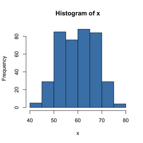
X-axis: The x-axis of a histogram represents the range of the data. It is typically divided into equal intervals, called bins.
Y-axis: The y-axis of a histogram represents the frequency of the data. The frequency is the number of data points that fall into each bin.
Bars: The bars of a histogram represent the number of data points that fall into each bin. The height of a bar is proportional to the frequency of the data in that bin.
Types of Histograms:
Frequency Histogram: In this type, the height of each bar represents the frequency of occurrences within a particular interval.
Relative Frequency Histogram: Here, the height of each bar represents the proportion or percentage of observations within a given interval relative to the total number of observations.
Cumulative Frequency Histogram: This histogram shows the cumulative frequency of data up to a certain point. Each bar represents the total frequency of observations up to that interval.
Graphical Representation:
A histogram is typically represented as a series of bars, with the x-axis representing the intervals or bins and the y-axis representing the frequencies, relative frequencies, or cumulative frequencies. The bars are usually contiguous and may or may not touch each other, depending on the type of data being represented.
When to Use Histogram?
The histogram graph is used under certain conditions. They are:
1. The data should be numerical.
2. A histogram is used to check the shape of the data distribution.
3. Used to check whether the process changes from one period to another.
4. Used to determine whether the output is different when it involves two or more processes.
5. Used to analyze whether the given process meets the customer requirements.
Difference Between Bar Graph and Histogram
| Feature | Bar Graph | Histogram |
|---|---|---|
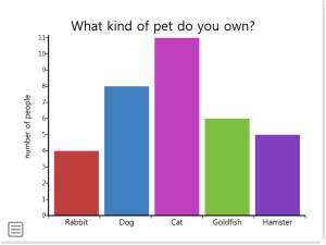
| Type of data | Categorical (e.g., fruits, professions) | Numerical (continuous or discrete) (e.g., height, weight, scores) |
| X-axis | Categories (order can be rearranged) | Range of data divided into bins (fixed order) |
| Spacing between bars | Equal spaces to distinguish categories | No spaces, bars touch to show continuous data |
| Bar characteristic | Height represents frequency/count of data in that category | Area represents frequency of data within that bin |
| Overall purpose | Compares categories, shows data distribution within categories | Reveals distribution of data (shape, outliers) |
Bar Graph
Histogram


Leave a Reply